Unlock deep insights from past F1 sessions with our comprehensive analysis tools.
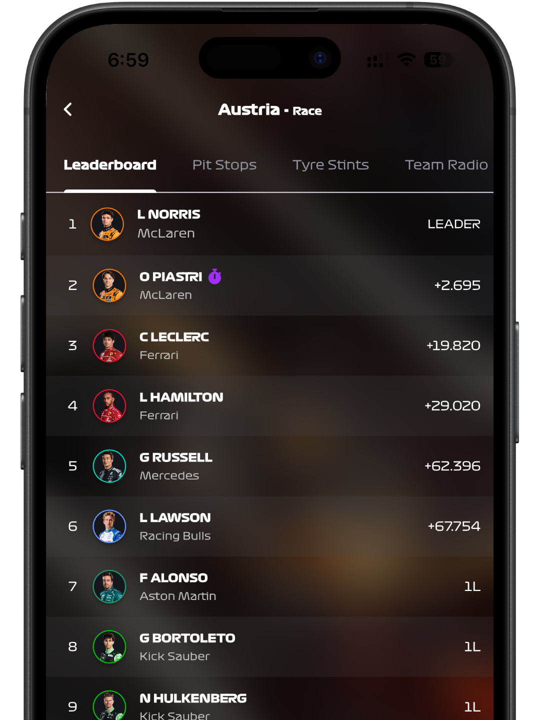
Access all previous sessions and their respective data: leaderboard, pit stops, tyre stints, team radio, FIA documents and more.
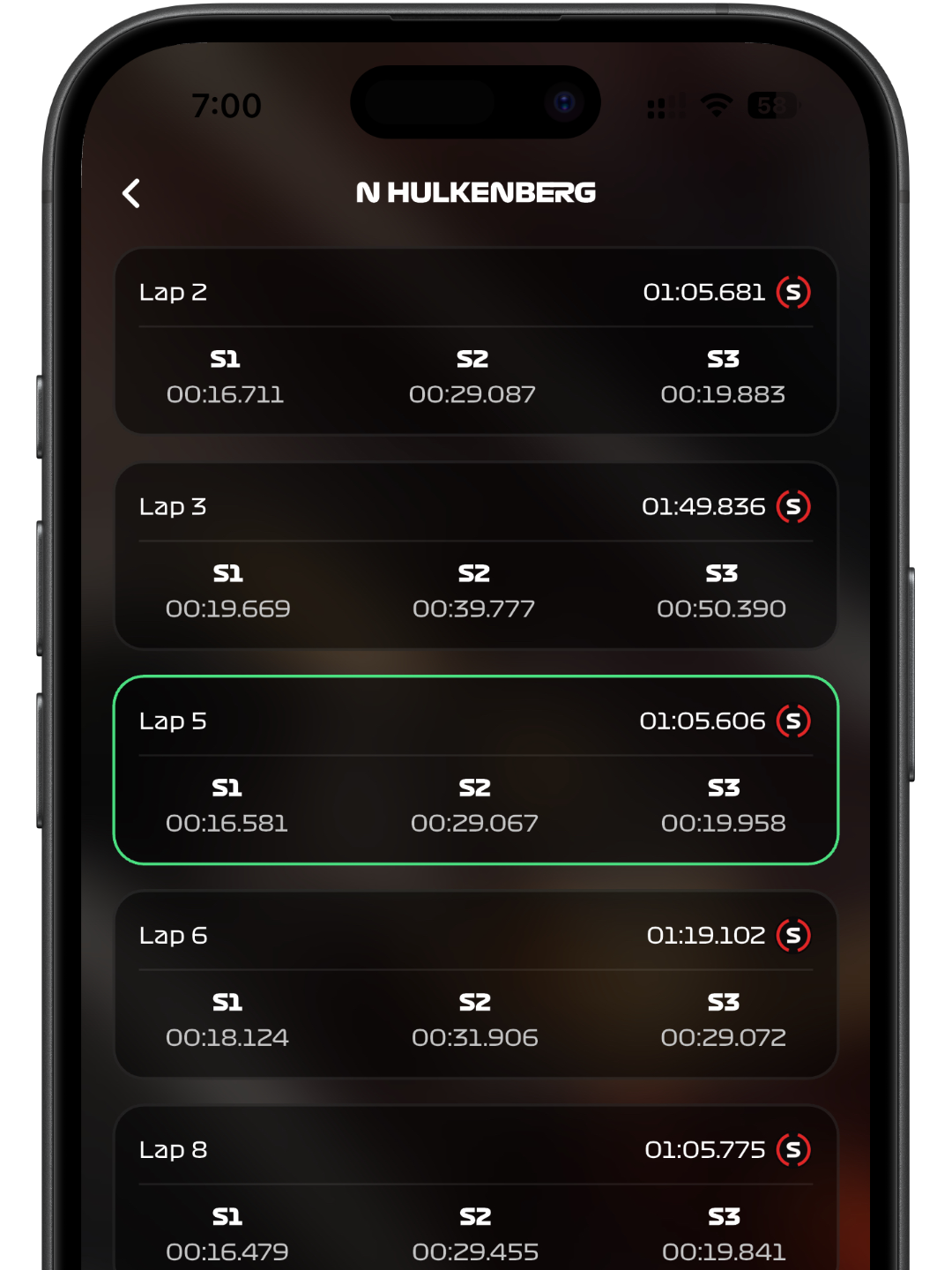
Explore detailed lap-by-lap performance for any driver. See a comprehensive list of their lap times, including individual sector times (S1, S2, S3) and the tire compound used for each lap, allowing for in-depth pace and strategy analysis.
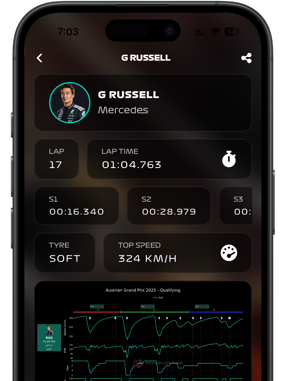
Dive deep into a driver’s fastest lap with a detailed telemetry chart. Visualize speed, throttle, brake, gear, and DRS usage over the lap distance. Don’t understand the squiggly lines? Just tap ‘Explain with AI’ for a clear breakdown of the driver’s performance on that lap.
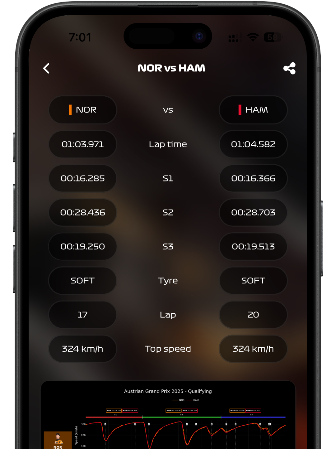
Pit two drivers against each other by comparing their fastest laps. See a side-by-side breakdown of their lap times, sector times and tyre choices. Analyze their combined telemetry on a single chart and view a ‘Track Dominance’ map to see who owned which parts of the circuit.
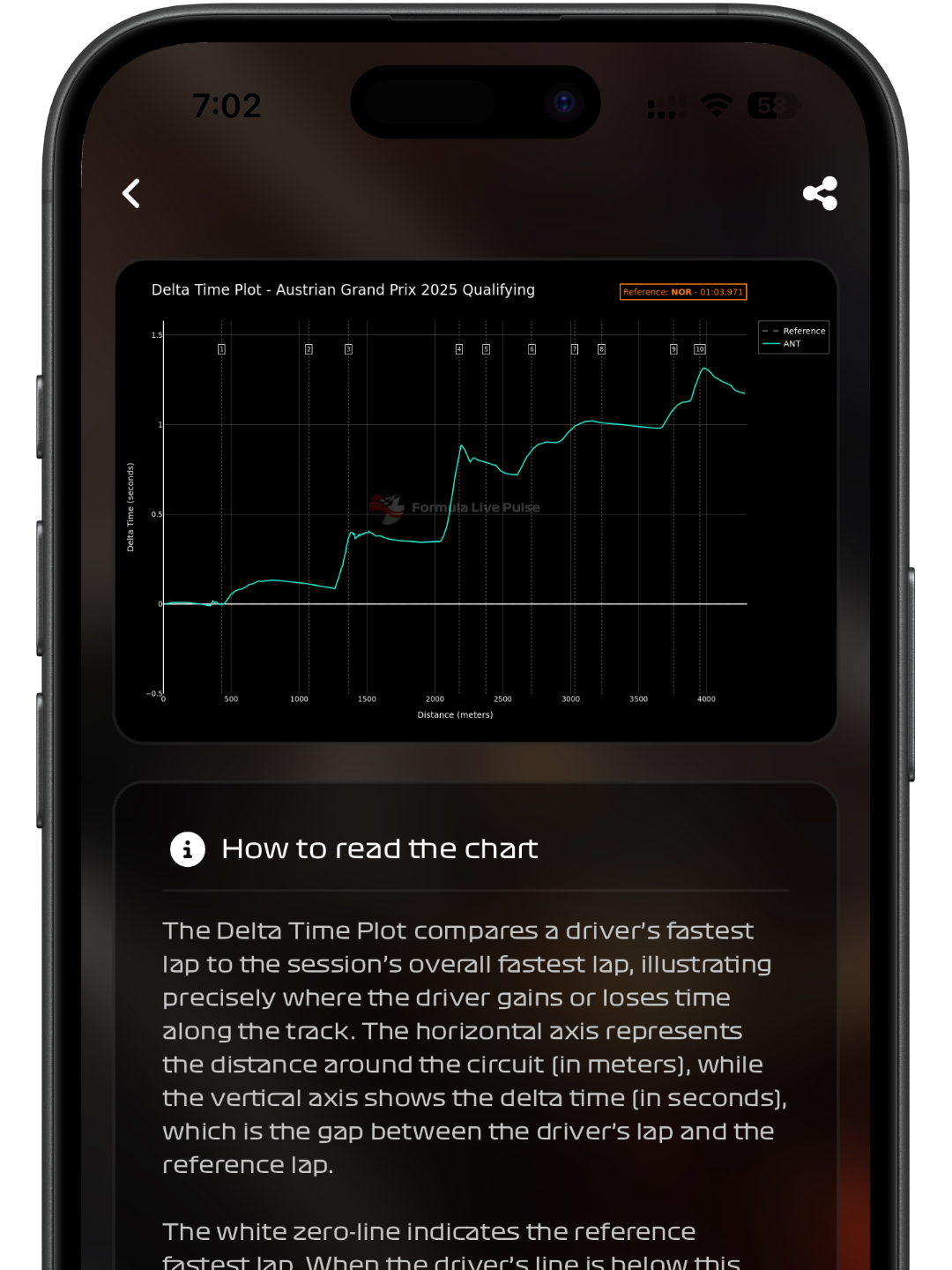
Analyze the trend of a driver’s delta time during their best lap, compared to the overall fastest lap of the entire session.
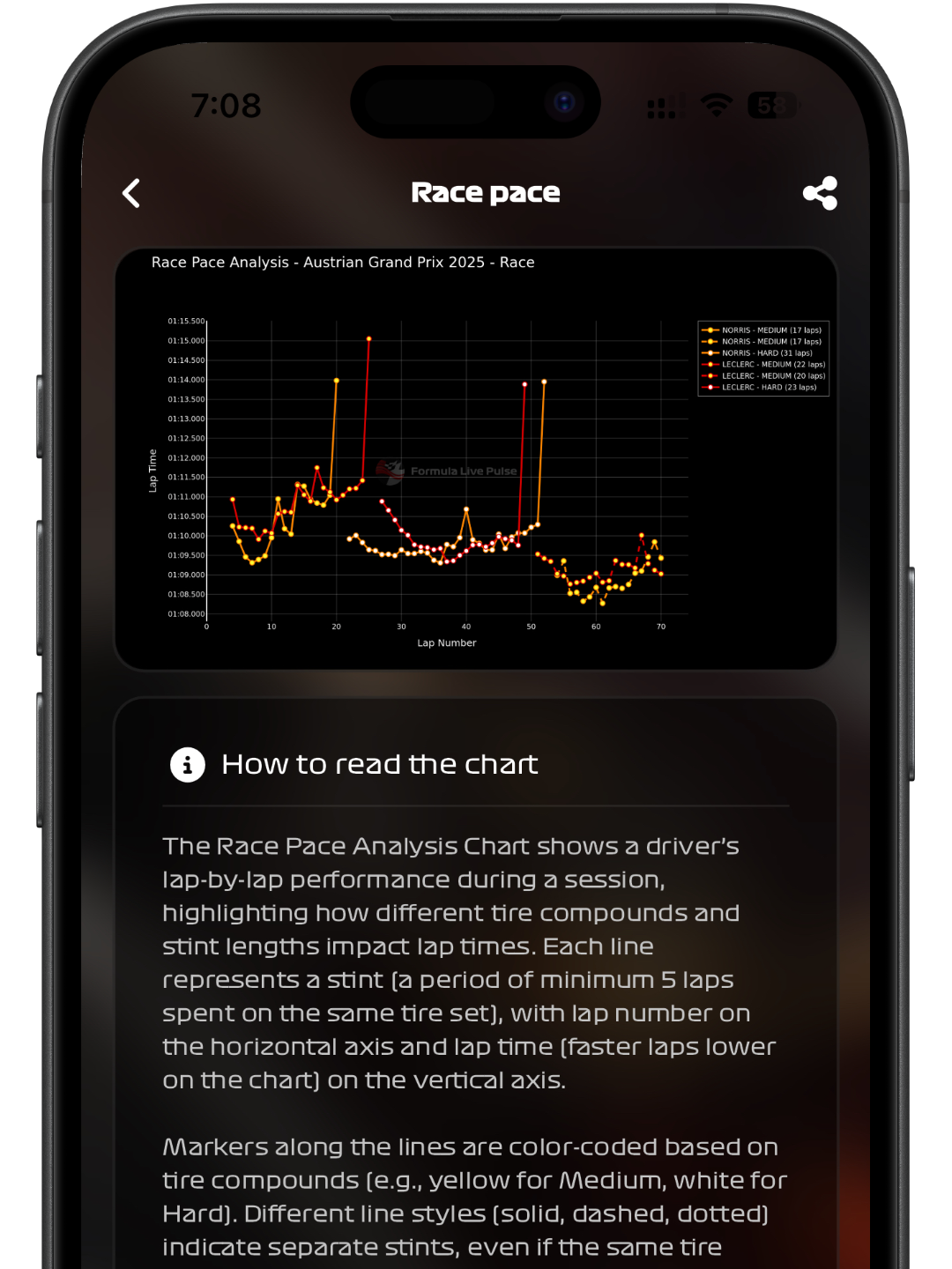
Compare the race pace of two drivers with a detailed lap-by-lap performance chart. Analyze how different tyre compounds and stint lengths affect their lap times throughout a session.
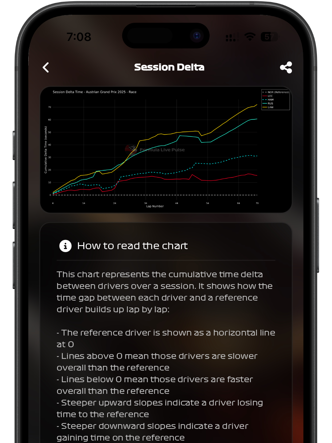
Analyze the cumulative time delta between drivers over an entire session.
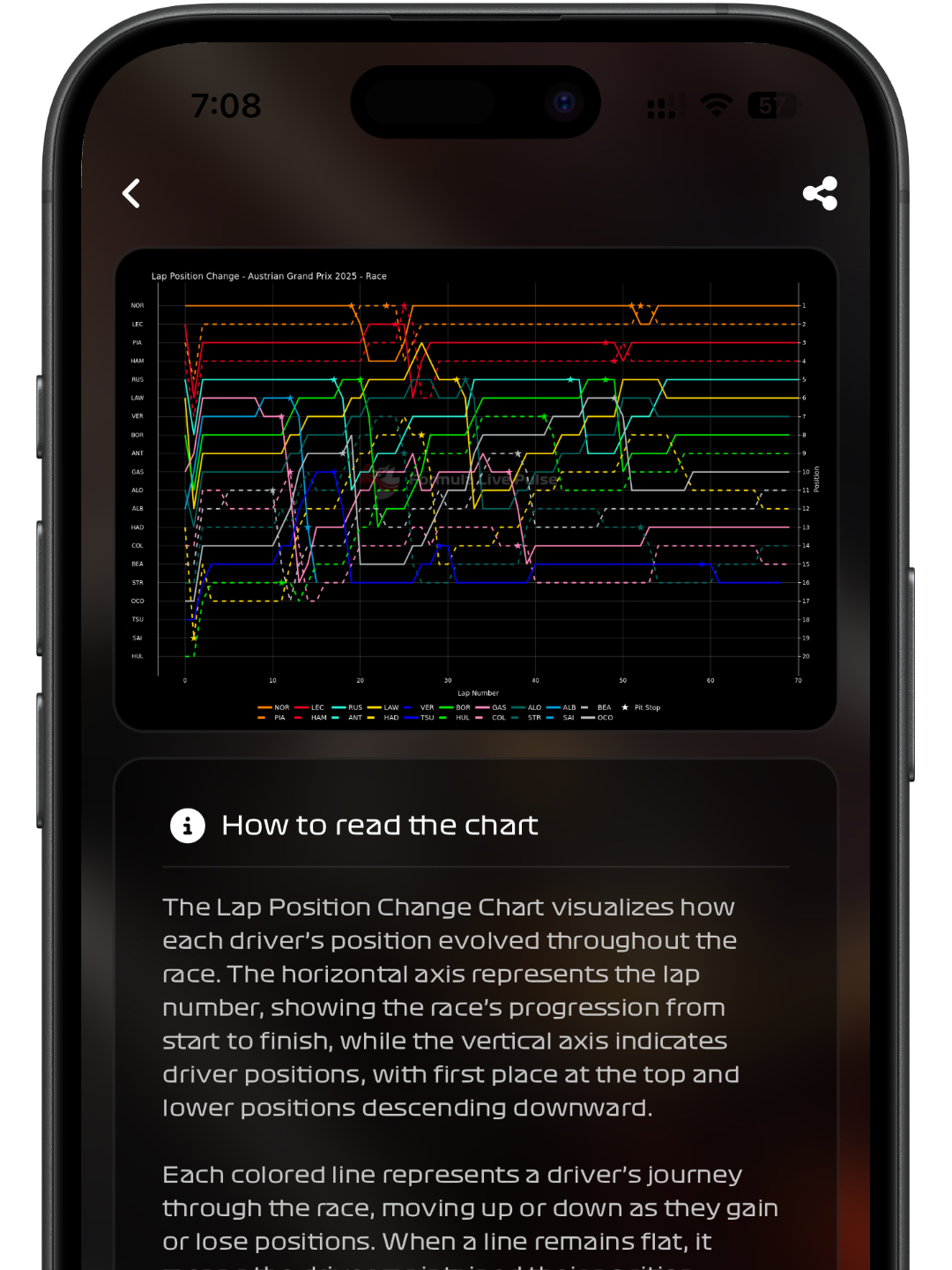
This visual tool shows how each driver’s position evolved from start to finish. The horizontal axis represents lap number, while the vertical axis displays driver positions. Each colored line follows a driver, moving up or down as they gain or lose places.
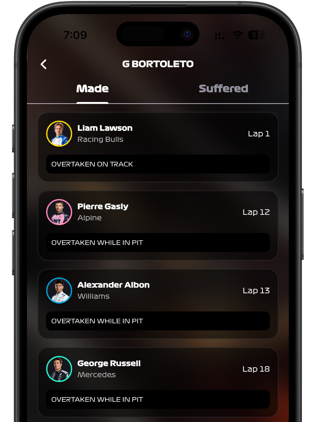
Analyze every pass with the Overtake Tracker. Select any driver to see a detailed list of overtakes they’ve made and suffered during the session. Each entry specifies the other driver involved (name and team), the lap number of the maneuver, and context like “Overtaken on Track” or “Overtaken while in Pit”.
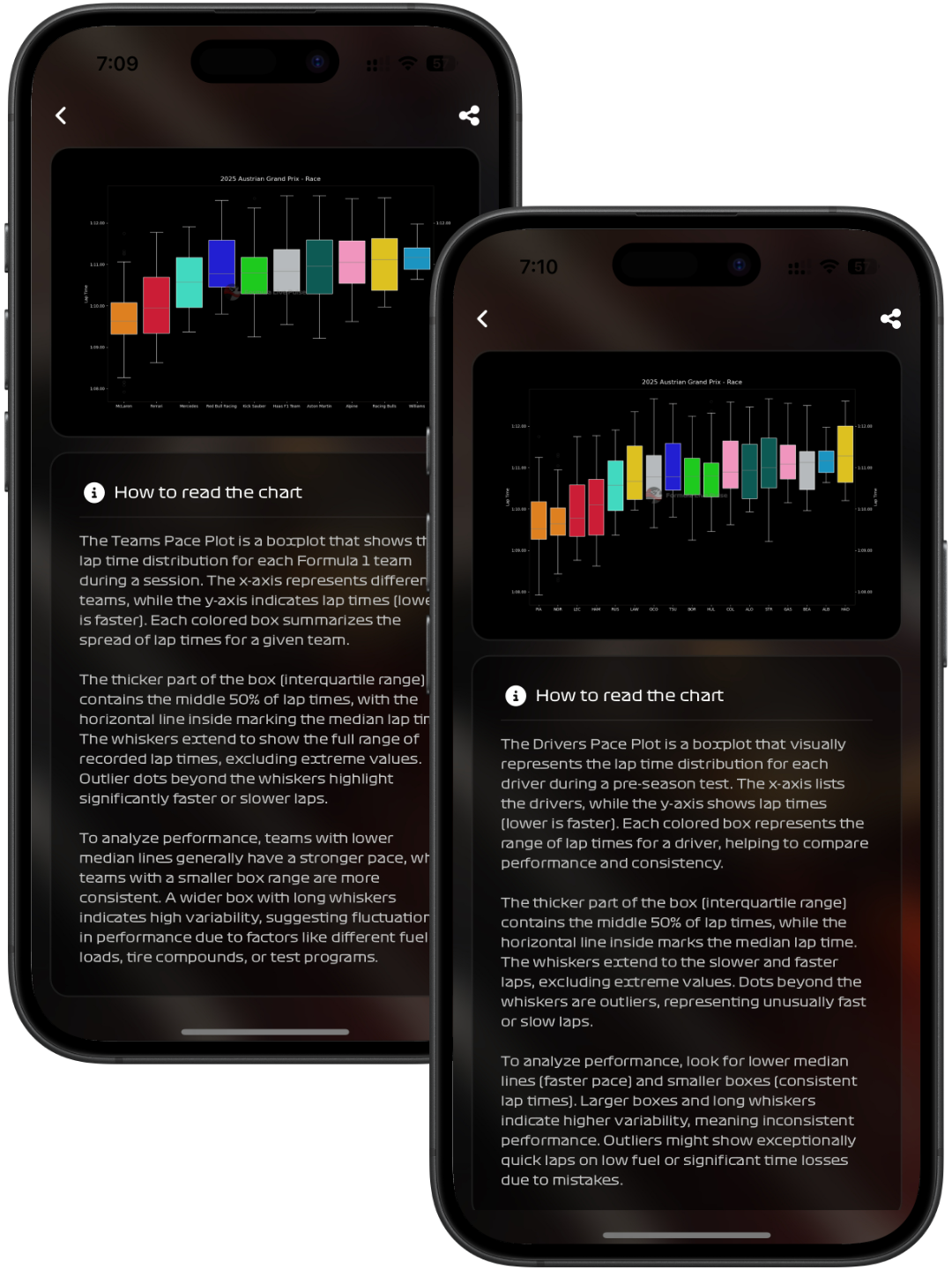
Evaluate team and driver performance using box plot charts that visualize lap time distribution. Each box represents the middle 50% of lap times, with a line marking the median lap time. Whiskers extend to show the spread of most lap times, excluding extreme outliers.
Get instant access to real-time Formula 1 data and AI-powered insights. Available for iOS and Android.